Getting scrolling right in a mobile horizontal list
With the release of Flex 4.5, you can now use Flex to build mobile applications. One of the features added to the Spark List to support mobile was the addition of bounce/pull effects at the beginning and end of a list. You can see this behavior by pulling down on the top of a list or up on the bottom of the list. When you do this, you will get a ‘bounce’ effect from the List’s boundaries.
In the majority of applications, you will choose to use a vertical list. However, occasionally, you may want to use a horizontal list. If you do this, you will get some strange default behavior with regards to scrolling in your horizontal list. In the horizontal direction, scrolling will work as expected. However, in the vertical direction, where there should be no scrolling, you will actual be able to pull up and pull down on the top and bottom boundaries. This is because the bounce and pull effects are actually still on in the vertical direction. To get the expected scrolling behavior for a horizontal list, you will want to turn verticalScrollPolicy=”off” on the List.
<s:List id=”colorList” dataProvider=”{colorsArray}” width=”100%” itemRenderer=”ColorRenderer”
y=”40″ selectedIndex=”0″ verticalScrollPolicy=”off”>
<s:layout>
<s:HorizontalLayout />
</s:layout>
</s:List>
For more information on this, you can check out bug: SDK-28980
Here is an example mobile project that uses a horizontal list of colors to select a frame for an image.
Source: ColorFun.fxp
Using a DateField itemRenderer for a Spark DataGrid
 Here is another simple example of using a custom itemRenderer in a Spark DataGrid. In this example, I am using an MX DateField component as an inline itemRenderer.
This DataGrid is also editable. Both columns “In Stock?” and “Availability Date” also have the property rendererIsEditor=”true”. This tells the DataGrid that the component specified as the itemRenderer is also the editor for this column. If you do not specify rendererIsEditor=”true”, then, updating the CheckBox or DateField will not actually affect the data. I am setting the selectedDate on the DateField via 2-way dataBinding:
selectedDate="@{data.availabilityDate}"
Here is the code that defines the column using the DateField itemRenderer:
<s:GridColumn headerText="Availability Date" dataField="availabilityDate"
     rendererIsEditable="true">
     <s:itemRenderer>
         <fx:Component>
             <s:GridItemRenderer>
                 <mx:DateField selectedDate="@{data.availabilityDate}"
                      horizontalCenter="0" verticalCenter="0"
                      width="90%"/>
             </s:GridItemRenderer>
         </fx:Component>
     </s:itemRenderer>
 </s:GridColumn>
Run the sample: DataGrid_DateFieldExample.swf
Source code: DataGrid_DateFieldExample.mxml
Using a Spark Form with Validators
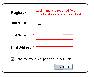
In this example, I’ve created a very simple registration form using Flex 4.5’s Form component. To validate the form, I am using MX StringValidator and MX EmailValidator. There are no Spark validators available for the fields I have in my form. Validation does not get triggered in this example until you click on the ‘Submit’ button.
By default, the FormItem skin puts the error message to the right of your Form Item. However, this was causing the width of my Form to double. I didn’t want the size of my Form to change significantly, so, I reskinned my FormItem to remove the “indicatorDisplay” and “errorTextDisplay”. Instead, I’ve chosen to show the validation errors for all three fields in a separate Label component that sits at the top of this Form.
In my Style block, I point to this custom FormItem skin:
<fx:Style>
@namespace s “library://ns.adobe.com/flex/spark”;
@namespace mx “library://ns.adobe.com/flex/mx”;
s|FormItem {
skinClass: ClassReference(“FormValidatorItemSkin”)
}
</fx:Style>
Sample SWF: SparkFormValidatorExample.swf
Sample Code: SparkFormValidatorExample.mxml, FormValidatorItemSkin.mxml
Where is drag and drop in the Spark DataGrid?
Before you spend any significant amount of time trying to figure out what APIs are available for enabling drag and drop on the Spark DataGrid, I thought I’d put it out there that it will not be available in the first Hero release of the component. In flash builder, I think you will get code hints for events like dragComplete, dragStart, dragEnter, dragOver, however, you won’t find the properties dragEnabled or dropEnabled.
I believe that the team plans to add drag and drop support in the next big release after Hero, but, features haven’t been set in stone and I certainly can’t promise anything.
For now, if you really need drag and drop in a Spark DataGrid, you are left writing your own. Sorry 😦 I was disappointed to hear the news too.
It’s a best practice to size a Spark DataGrid’s columns with a typicalItem
Coming from Flex 3, if I wanted to set the size of my DataGrid columns to ensure that all of my data was displayed correctly, I would either set column widths with explicit values or percentages. In Flex 4, explicit width columns is no longer the recommended way of figuring out the size of columns according to Spark DataGrid’s architect Hans Muller who schooled me when I mentioned the need to fix a bug that involved explicit width columns.
By default, a DataGrid will use the first item in its dataProvider to determine the size of each column. This may not be what you want. If you specify a typicalItem on the DataGrid, the columns will be large enough to fit this item. This item does not need to be a part of your dataProvider.
Specifying explicit column widths can be problematic because the width can be invalidated by a host of factors: implicit renderer changes, e.g. due to inherited styles, explicit renderer changes, margin/padding and other layout configuration changes, as well as text and text format localizations. For all of these reasons, using the typicalItem is better.
In the following example, I have two DataGrids with the same data and columns. The first one specifies a typicalItem where the data includes the longest strings that I want to display in my columns. The second DataGrid uses no typicalItem and therefore sizes its columns using the first item of the dataProvider.
Sample application: TypicalItem_DataGrid_Example.swf
Sample MXML: TypicalItem_DataGrid_Example.mxml
If you change your typicalItem, you will need to call invalidateTypicalItem() notifying the DataGrid of this change.
Note, almost all of this information was compiled from picking the brain of Hans Muller, I hope I’ve accurately represented his thinking.
Adding an icon to the header for a Spark DataGrid
Adding a static icon to the header of Spark DataGrid is very easy. You will need to create a custom headerRenderer and specify it for your GridColumn. Here are the steps:
1. Copy the contents of the skin file: DefaultGridHeaderRenderer.mxml and paste it into a new mxml f ile that will be used as your custom headerRenderer.
2. In the custom header renderer, find the HGroup at the end of the skin file. Add a BitmapImage as the first element in the HGroup (before the ‘labelDisplay’ Group).
<s:BitmapImage source="beer.JPG" />
3. You might want to make some padding or gap changes to the HGroup to position your icon. This example changed the gap to 8.
4. Specify this custom headerRenderer for your GridColumn:
<s:GridColumn id="c1_2" dataField="name" headerText="Pub Name"
    headerRenderer="IconHeaderRenderer2"/>
Voila! It’s simple. Note, if you wanted to modify the sortIndicator, you can also do it by creating a custom header renderer based off of the default one.
Sample Code: IconHeaderExample.mxml, IconHeaderRenderer.mxml IconHeaderRenderer2.mxml
Outlining the selected row in a Spark DataGrid
In this example, I am setting a red outline/stroke around the selected row in a DataGrid. At first, I thought I would need a custom itemRenderer. However, I discovered that the UI for how the DataGrid looks in its hovered, selected, disabled and normal states are determined by the DataGrid skin. Therefore, to get this selected row outlined, I created a custom DataGrid skin using the Flash Builder templates. In the DataGrid skin, I just added the following to the selectionIndicator component:
<s:stroke>
<s:SolidColorStroke color=”0xC00000″ weight=”3″ />
</s:stroke>
Run the example: DataGridStrokedSelectionExample.swf
Sample Code: DataGridStrokedSelectionExample.mxml, StrokedSelectedItemSkin.mxml
Changing the background color of a row using itemRendererFunction in Spark
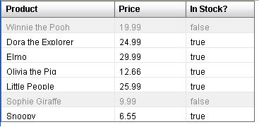
Changing the background color of a cell in a DataGrid is much easier, in my opinion, using the Spark architecture. The itemRenderer I am using is all mxml and uses the Rect graphic as the background. Here is the simple itemRenderer with a gray background and grayed out text.
<?xml version=”1.0″ encoding=”utf-8″?>
<s:GridItemRenderer xmlns:fx=”http://ns.adobe.com/mxml/2009″
xmlns:s=”library://ns.adobe.com/flex/spark”
xmlns:mx=”library://ns.adobe.com/flex/mx” clipAndEnableScrolling=”true”>
<fx:Script>
<![CDATA[
override public function prepare(hasBeenRecycled:Boolean):void {
lblData.text = data[column.dataField]
}
]]>
</fx:Script>
<s:Rect top=”0″ bottom=”0″ right=”0″ left=”0″>
<s:fill>
<s:SolidColor color=”#E0E0E0″ alpha=”0.5″/>
</s:fill>
</s:Rect>
<s:Label id=”lblData” top=”9″ left=”7″ color=”0x505050″ alpha=”0.5″/>
</s:GridItemRenderer>
Using itemRendererFunction, I am determining whether to use this custom itemRenderer with the gray background, or the DefaultGridItemRenderer. If the item is in stock, use the DefaultGridItemRenderer, if it is not, use the custom itemRenderer. My itemRenderer function looks like this:
private function product_itemRendererFunction(item:Object, column:GridColumn):ClassFactory {
if(item.inStock)
return new ClassFactory(DefaultGridItemRenderer);
else
return new ClassFactory(OutOfStockItemRenderer);
}
Here are the files to download.
Sample Code: DataGrid_itemRendererFunctionExample.mxml, OutOfStockItemRenderer.mxml
Sample SWF: DataGrid_itemRendererFunctionExample.swf
Using a CheckBox in a Spark DataGrid
Today, we just posted a new stable build of the Flex 4.5 SDK on our opensource site. This is build 19786 and it includes a lot of improvements in our Spark DataGrid from the last stable build from November. Since the APIs for the DataGrid will likely not change between now and our release, I thought I’d start posting some simple DataGrid tutorials.
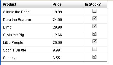
First up, this example shows how to use a CheckBox as an itemRenderer in a Spark DataGrid. Coming from Flex 3, you will notice that the syntax for the Spark DataGrid is slightly different.
In this example, I have a three column DataGrid. The first two columns use the default itemRenderer. The last column uses an inline itemRenderer of a centered CheckBox.

Sample Code: DataGrid_CheckBoxExample.mxml
Run Sample: DataGrid_CheckBoxExample.swf


