Using a DateField itemRenderer for a Spark DataGrid
 Here is another simple example of using a custom itemRenderer in a Spark DataGrid. In this example, I am using an MX DateField component as an inline itemRenderer.
This DataGrid is also editable. Both columns “In Stock?” and “Availability Date” also have the property rendererIsEditor=”true”. This tells the DataGrid that the component specified as the itemRenderer is also the editor for this column. If you do not specify rendererIsEditor=”true”, then, updating the CheckBox or DateField will not actually affect the data. I am setting the selectedDate on the DateField via 2-way dataBinding:
selectedDate="@{data.availabilityDate}"
Here is the code that defines the column using the DateField itemRenderer:
<s:GridColumn headerText="Availability Date" dataField="availabilityDate"
     rendererIsEditable="true">
     <s:itemRenderer>
         <fx:Component>
             <s:GridItemRenderer>
                 <mx:DateField selectedDate="@{data.availabilityDate}"
                      horizontalCenter="0" verticalCenter="0"
                      width="90%"/>
             </s:GridItemRenderer>
         </fx:Component>
     </s:itemRenderer>
 </s:GridColumn>
Run the sample: DataGrid_DateFieldExample.swf
Source code: DataGrid_DateFieldExample.mxml
Finding the maximum scroll position of a Spark List
Recently, we had a very important person (at least in my opinion), leave our QA team. Peter deHaan, author of Flex Examples left Adobe for bigger and brighter things. If you are new or old to Flex, you have at some point found yourself on Peter’s Flex Examples blog. Since he has moved on, you’ll probably hear nothing but crickets coming from Flex Examples. (Peter, correct me if I’m wrong!)
So, some of us on the team were thinking that we needed to get our butts in gear and begin blogging on a more frequent basis to fill the void. I’m starting with this very simple example of ‘finding the maximum scroll position of a Spark List’. This is helpful whenever you want to scroll down to the end of a List in your application. I recently had this need when I was building a mobile app.
To find the max scroll position, you should subtract the height or width of the DataGroup from the contentHeight or contentWidth of the DataGroup.
maxVerticalScrollPosition = myList.dataGroup.contentHeight – myList.dataGroup.height;
Here are examples:
Source: MaxScrollPositions.mxml
360Flex Sample: Building a Performant itemRenderer by extending UIComponent
In our 360 Flex itemRenderer talk, Ryan showed an example of building a performant itemRenderer. He built an editable star rating itemRenderer that looks similar to what you would see on the netflix website.
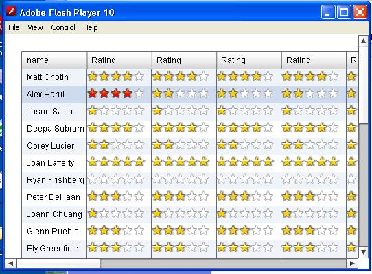
In a sample use case, he showed an application that would display several hundred itemRenderers using this ‘StarRating’ itemRenderer.
Ryan showed two different implementations for the same resulting application. In the first implementation, the itemRenderer extending the HBox class. Since the HBox already lays out children for you, the itemRenderer only needed to create and add children to the container. In the second implementation, the itemRenderer extended UIComponent. For this itemRenderer, you needed to do your own measurement and placement of the children. Its a little more work, but, in the end, the itemRenderer built on top of UIComponent was much more performant. In this use case which only included 5 children in the itemRenderer, you saved about 25% on the startup time.
Containers in Flex are pretty heavy weight. They include logic for scrolling, placement of children and a lot of measure code. Therefore, if you are worried about performance when you are displaying data, you should base itemRenderers off of UIComponent instead.
When basing an itemRenderer off of UIComponent, remember to do the following:
1) implement IDataRenderer
2) implement IDropInListItemRenderer and IListItemRenderer if you want to reuse this itemRenderer in multiple columns
3) create and add your children in the createChildren method.
4) define the sizing of your itemRenderer and its children in the measure() method.
5) define the placement of your itemRenderer’s children in the updateDisplayList() method.
For examples on how to do this, download the sample files from our talk here: StarRating.zip
Description of Sample Files:
RatingExample5.mxml – Main application using an itemRenderer based off of HBox
RatingExample6.mxml – Main application using an itemRenderer based off of UIComponent
StarRatingRenderer5.as -ItemRenderer based off of HBox
StarRatingRenderer6.as – ItemRenderer based off of UIComponent
Slides and Examples from ItemRenderer Talk at MAX (Flex 360)
Thanks to Ryan for putting up the slides and examples from our talk at Flex 360 (at MAX). You can find them here:
Slides: Custom ItemRenderers.pdf
Examples: Max360ItemRendererTalkFBCode.zip
The zip file includes samples that both Ryan and I wrote. I wrote the following examples, so, if you have any questions, post a comment about them here.
– Creating a reusable itemRenderer that changes the background color of a cell (FlexActivities.mxml)
– An itemRenderer example using States (NewsExample.mxml). This example does not work well in our Gumbo alpha (which was given away at MAX). I think there are some bugs in our new development around transitions.
– An example using HSlider as an itemRenderer and editor (RatingExample.mxml)
How to set a ComboBox itemEditor dataProvider at runtime
On a forum (probably flexcoders), someone recently asked how to set the dataProvider for a ComboBox itemEditor at runtime. They wanted to set a different dataProvider for each of the ComboBoxes depending on their data. So, I decided to put this quick example together using a DataGrid with inline itemEditors that are ComboBoxes.
The DataGridColumn itemEditor that uses a ComboBox looks like this:
<mx:DataGridColumn dataField=”city” headerText=”Destination City” editorDataField=”
selectedItem”>
<mx:itemEditor>
<mx:Component>
<mx:ComboBox initialize=”outerDocument.addData(event)” />
</mx:Component>
</mx:itemEditor>
</mx:DataGridColumn>
In the ComboBox’s initialize handler, we are calling a function that will set its dataProvider. Her is what the function addData looks like:
public function addData(event:FlexEvent) : void
{
if(dg.dataProvider[dg.selectedIndex][‘country’] == “Italy”)
ComboBox(event.target).dataProvider = ItalianCities;
else
ComboBox(event.target).dataProvider = UKCities;}
The function checks what the selected item, then, they set a dataProvider for the editor accordingly.
You can run the sample here: ComboBoxItemRendererSample.swf
In the example, click any row in the right side column to bring up the itemEditor that is a ComboBox.
Baseline alignment with constraints in Flex 3
One of the minor improvements in Flex 3 regarding layout is baseline alignment. Setting the baseline constraint means that the user is specifying an offset from the top edge of a constraint region or parent border and the control’s baseline. By offering a baseline constraint style, we can now allow multiple components to be constrained along a single shared baseline. Here is an example of two panels. One has no baseline set on the components. The other uses a baseline and a ConstraintRow.
The Panel using a baseline constraints looks like this:
| <mx:Panel title=”baseline in a ConstraintRow” layout=”absolute” > <mx:constraintRows> <mx:ConstraintRow height=”200″ id=”row1″/> <mx:ConstraintRow height=”100″ id=”row2″/> </mx:constraintRows> <mx:Text text=”San Francisco” baseline=”row1:20″ /> <mx:Button label=”Newton” x=”70″ baseline=”row1:20″ /> <mx:DateChooser x=”140″ baseline=”row1:20″ /> <mx:Label text=”Romania” x=”310″ baseline=”row1:20″ /> </mx:Panel> |
Demo: simpleBaseline.swf
Source: simpleBaseline.mxml
At this time, you cannot set the verticalAlign style to a baseline. This is still an open bug: SDK-11725
Loading css when your application starts up
In Flex 2.0.1, Flex introduced a feature enabling runtime css. This meant that your application could load a different stylesheet at runtime using the method StyleManager.loadStyleDeclaration(url). This allows your Application’s swf to be much smaller if you had multiple stylesheets for one Application that may or may not be used. Unfortunately, you cannot load the css directly. Instead, you would need to compile the css using the Flex compiler. The compilation of a css file will create a swf file that can be specified as an argument to loadStyleDeclarations method. Here is the description of this method from the Flex livedocs:
public static function loadStyleDeclarations(url:String, update:Boolean = true, trustContent:Boolean = false, applicationDomain:ApplicationDomain = null, securityDomain:SecurityDomain = null):IEventDispatcher Loads a style SWF.
Parameters
| url:String — Location of the style SWF. | |
| update:Boolean (default = true) — Set to true to force an immediate update of the styles. Set to false to avoid an immediate update of the styles in the application. This parameter is optional and defaults to true For more information about this parameter, see the description in the setStyleDeclaration() method. | |
| trustContent:Boolean (default = false) — Obsolete, no longer used. This parameter is optional and defaults to false. | |
| applicationDomain:ApplicationDomain (default = null) — The ApplicationDomain passed to the load() method of the IModuleInfo that loads the style SWF. This parameter is optional and defaults to null. | |
| securityDomain:SecurityDomain(default = null) — The SecurityDomain passed to the load() method of the IModuleInfo that loads the style SWF. This parameter is optional and defaults to null. |
Returns
| IEventDispatcher — An IEventDispatcher implementation that supports StyleEvent.PROGRESS, StyleEvent.COMPLETE, and StyleEvent.ERROR. |
So, how can you load css at runtime and not create any of the components in your application until the styles were loaded? You want to be sure that your components don’t show up on screen with default styles for a brief amount of time while the css is being loaded. There are probably a few ways to do this, but, here is one that I found that works.
1. Call StyleManager.loadStyleDeclarations(url) in the preinitialize handler for your <mx:Application>
2. Make sure that your <mx:Application> has a creationPolicy=”none”.
3. When, the StyleEvent.COMPLETE event is triggered after the call to loadStyleDeclarations, then, you can call createComponentsFromDescriptors(). This method will create all of the children of the container that it is called on.
Here is the code in the Application:
| <?xml version=”1.0″ encoding=”utf-8″?> <mx:Application xmlns:mx=”http://www.adobe.com/2006/mxml” width=”100%” height=”100%” preinitialize=”changeTheme()” creationPolicy=”none”> <mx:Script> <