Adding an icon to the header for a Spark DataGrid
Adding a static icon to the header of Spark DataGrid is very easy. You will need to create a custom headerRenderer and specify it for your GridColumn. Here are the steps:
1. Copy the contents of the skin file: DefaultGridHeaderRenderer.mxml and paste it into a new mxml f ile that will be used as your custom headerRenderer.
2. In the custom header renderer, find the HGroup at the end of the skin file. Add a BitmapImage as the first element in the HGroup (before the ‘labelDisplay’ Group).
<s:BitmapImage source="beer.JPG" />
3. You might want to make some padding or gap changes to the HGroup to position your icon. This example changed the gap to 8.
4. Specify this custom headerRenderer for your GridColumn:
<s:GridColumn id="c1_2" dataField="name" headerText="Pub Name"
    headerRenderer="IconHeaderRenderer2"/>
Voila! It’s simple. Note, if you wanted to modify the sortIndicator, you can also do it by creating a custom header renderer based off of the default one.
Sample Code: IconHeaderExample.mxml, IconHeaderRenderer.mxml IconHeaderRenderer2.mxml
Gradient Backgrounds for Spark Containers
One of my very first posts on this blog was about how to create a “Generic Background Gradient for Containers“. In Flex 3, you could only use styles to create solid backgrounds for your various MX Containers. To accomplish a gradient background, you needed to write your own custom class that used the flash player’s native APIs to draw gradients. After I posted this, multiple people also wanted to know how to give the container with a background rounded corners. You had to jump through a few extra hoops in your background gradient class to get this done, too.
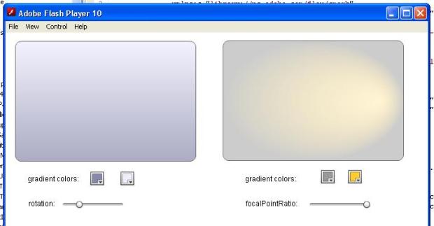
Now, I decided to recreate the same scenario in Flex 4 with Spark containers. How would I create a background gradient for a Spark container? Actually, it was soooo easy. I didn’t need to write one line of Actionscript. I simply used the BorderContainer component and created either a LinearGradient fill or a RadialGradientFill for it. I could also specify a cornerRadius style for BorderContainer to give it rounded corners. So, while you had to use a custom AS class in Flex 3, a gradient background on a Spark container looked like this:
<s:BorderContainer width=”300″ height=”200″ cornerRadius=”10″ x=”16″ y=”13″>
<s:backgroundFill>
<s:LinearGradient id=”gradient1″ rotation=”90″>
<s:entries>
<s:GradientEntry id=”entry1″ color=”0xEEEEFF” alpha=”0.7″/>
<s:GradientEntry id=”entry2″ color=”0x8888AA” alpha=”0.7″ />
</s:entries>
</s:LinearGradient>
</s:backgroundFill>
</s:BorderContainer>
Super simple! The example that you can download from this entry shows you how to create both linear and radial gradients.
Sample Code: gradientBackgroundSample.mxml
Sample SWF: gradientBackgroundSample.swf
Using Flex Builder 3 with the Flex 4 SDK
At Flex 360, someone asked me where they could find out how to use our Flex 4 SDKs with Flex Builder 3 because Builder 4
isn’t available to the public. This is pretty easy thanks to the multiple SDK support in Builder. So, as promised to a customer,
here are the instructions for using Flex Builder 3 with the Flex 4 Gumbo SDK.
1) Download the Gumbo SDK – Go to opensource.adobe.com.
2) Unzip the flex_sdk_4.zip to some location on your hard drive. For the purposes of this tutorial, we’ll download it to
C:/Flex4/trunk/7069
3) Open up Flex Builder 3 and create a new Flex project.
4) Right-click on the project and select the ‘Properties’ option. This should open the Properties panel.
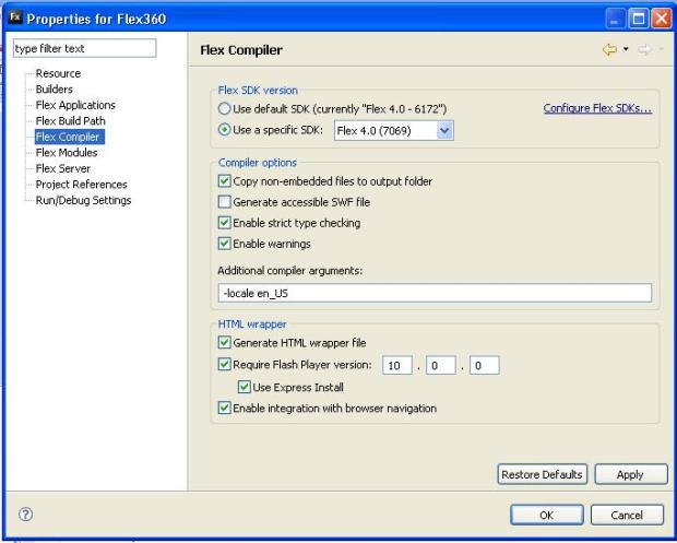
5) From the left hand menu, select ‘Flex Compiler’ to view the Flex Compiler properties
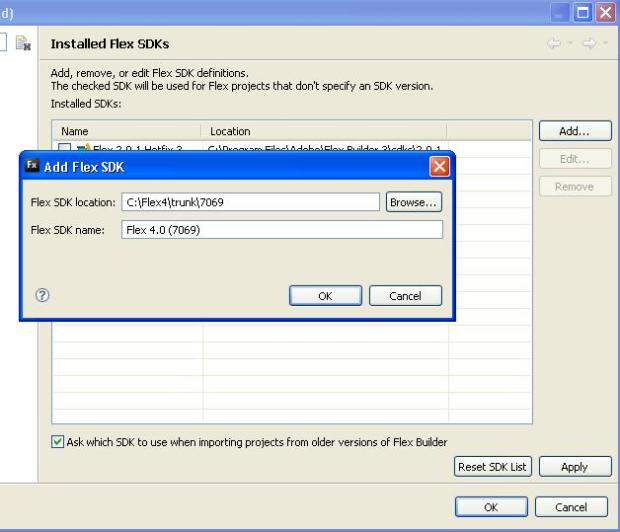
6) In the Flex Compiler properties view, click on the link ‘Configure Flex SDKs…’

7) You should be in the ‘Installed Flex SDKs’ view. click on the button ‘Add’.
8) In the resulting dialog, browse to the location that you installed the SDK (from step #2). Then, click ‘OK’.

The Flex 4 Gumbo SDK should now be added to the list of SDKs available for you to use for this project.
9) Press ‘OK’ in the “Installed Flex SDKs” dialog bringing you back to the main ‘Flex Compiler’ properties
dialog.
10) In the ‘Flex Compiler’ dialog, select the radio button for ‘Use a specific SDK’ and
select the Flex 4 SDK that you added.
11) In the ‘Flex Compiler’ dialog, for ‘Require Flash Player version:’, enter 10.0.0. Flex 4
will only support Flash Player 10 content. If you compile to player 9, you will get an error.

12) Press ‘OK’ to close your dialog.
13) Note that when you create new mxml files for this project, the default tags will still be the tag
with the old namespace. You will need to manually change the mxml to use our new Spark Application tag and the new namespaces.
To get started with your first spark application. Feel free to use the sample below which is a simple spark application using the
3 new namespaces and some spark components (s:) along with halo components (mx:).
Note: If you try to compile a Flex 3 application with Flex 4, be aware of some of the migration issues that you’ll face that I mentioned
in a previous post.
Have fun playing with Spark!
Download Sample Spark App: firstSample4App.mxml
What styles work on Spark skins?
As you might begin playing with the Flex 4 framework, you will notice that both the new set of ‘Spark’ components and our ‘Halo’ components that were shipped with Flex 3 have a new look. By default, all of the components in Flex 4 use the ‘Spark’ theme. In Flex 3, we shipped with the ‘Halo’ theme, by default.
If you are a Flex 3 developer, you will notice that the Spark skins don’t support many of the styles that you are used to including border altering styles, corner radius, fillColors etc. Instead, the Spark skins only support a handful of global styles. The include the following:
baseColor: The baseColor usually affect the fill of components like Buttons, Tabs, and the headers. It also affects borders of components like List, TextInput, TextArea and a number of other components.
color: The color style is the same as Flex 3 and affects the color of Text in any component.
focusColor: The focusColor affects the color of the focus ring for all components that take focus.
symbolColor: The symbolColor affects components with any type of icon/symbol. For example, the dot for a RadioButton, check for a CheckBox, and the arrows for a NumericStepper, DataGrid header or ScrollBar.
rollOverColor: The rollOverColor acts the same as Flex 3. It only applies to List components when you roll over items.
selectionColor: This style affects the color of an item that is selected in a List. It also affects the color of the highlight when you select text in components like a TextInput and TextArea. The selectionColor only affects text for the new Spark components, not the Flex 4 components due to some enhancements in player 10.
contentBackGroundColor: This style is similar to backgroundColor. For most components that has a ‘backgroundColor’ style, you would use the contentBackgroundColor style with the Spark skins.
To see how these styles affect the new Flex 4 Spark components, check out this application. For each view tab view, you can change a style and see how it affects various components at runtime.
Demo: StylesDemo.swf
Source Code: StylesDemo.mxml
Note: Most text styles like fontFamily, textDecoration, fontStyle, fontWeight, fontSize etc. still work using the Spark skins.
Compiling in Flex 4 with the Halo theme
I’ve mentioned this in a previous post, but, I’m going to post it again because it probably got buried in a longer post.
In the Flex 4 SDK, we automatically use the Spark theme which you might not want. Many styles don’t work in this theme and you might want to go back to the theme from Flex 3. Flex 3 used the “Halo” theme.
This theme can still be found in the SDK under <sdk dir>/frameworks/themes/Halo/halo.swc. To compile an application in Flex 4 with the halo theme, your mxmlc compile statement will look something like this:
>./mxmlc -theme=../frameworks/themes/Halo/halo.swc

 So, your ButtonBar will use a custom skin: